Iconography
Contents
Icons play a crucial role in user interfaces by providing a visual language that enhances usability, clarity, and interaction. Our design system includes a comprehensive icon set that is categorized based on different styles and use cases.
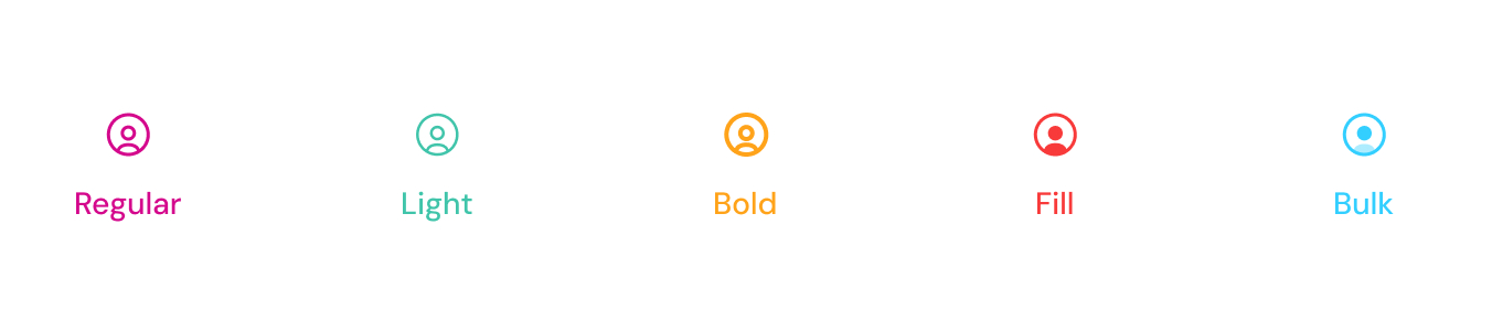
Regular
Simple, scalable icons designed for minimalistic UI. These icons can be used as font-based elements with class names, such as:
HTML
<span class="tticon-user"></span>
Light
Thin-lined icons designed for a subtle and elegant UI appearance. These icons can be used as font-based elements with class names, such as:
HTML
<span class="tticon-user-light"></span>
Bold
High-contrast, filled icons designed for strong visual emphasis and enhanced readability. These icons can be used as font-based elements with class names, such as:
HTML
<span class="tticon-user-bold"></span>
Fill
Icons with a completely filled design, providing a clear and distinct appearance. These icons can be used as font-based elements with class names, such as:
HTML
<span class="tticon-user-fill"></span>
Bulk
Filled icons designed for strong visual impact and better accessibility. These icons are available in SVG format to ensure flexibility in customization.
SVG
<svg width="24" height="24" viewBox="0 0 24 24" fill="none" xmlns="http://www.w3.org/2000/svg">
<path d="M10 2C5.58 2 2 5.58 2 10s3.58 8 8 8c2.47 0 4.74-1 6.4-2.6l4.2 4.2 1.4-1.4-4.2-4.2C19 14.74 20 12.47 20 10c0-4.42-3.58-8-8-8zM4 10c0-3.31 2.69-6 6-6s6 2.69 6 6-2.69 6-6 6-6-2.69-6-6z" stroke="black" stroke-width="1.5"/>
</svg>
Icon Font
You can browse and download the icon font, and find the class names on the font website here.
Best Practices
✅ Use Outline icons for general UI elements where font-based scaling is required.
✅ Use SVG for complex icons that require detailed rendering or color variations.
✅ Maintain consistency by using the same style across similar components.
❌ Avoid excessive icon usage, which may clutter the UI.
Icon Source: Iconly
Our icon set is sourced from Iconly, a premium icon library known for its modern and consistent icon styles.
- License
Iconly is a paid library, but it provides a free trial version with a limited set of icons.
- Styles Available
The collection includes Outline, Bold, Bulk, Light, Broken, TwoTone, and Social icons, ensuring flexibility across different UI elements.
- Scalability
Icons are available in SVG format for customization, as well as font-based usage for specific styles like Outline.
For more details, visit the official Iconly website. 🚀
Last updated 3 months ago