Guidelines
Layout and spacing
Contents
Proper layout structure and spacing rules ensure a clean, organized, and responsive design. This guide covers the grid system, margins, paddings, and spacing rules used in our design system.
Grid System
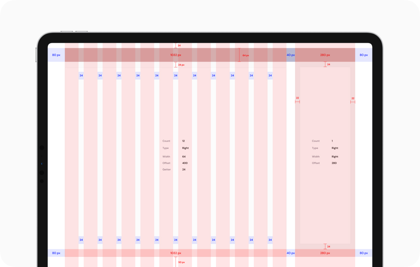
We use a 12-column grid to maintain consistency across different screen sizes.
| Column Width | 64px |
| Gutter Width | 24px |
| Total Grid Width | 1032px |
| Offset | 40px (Between Sidebar and content) |
| Side Margins | 80px |
| Top Offset | 24px |
| Bottom Offset | 50px |
CSS
.container {
display: grid;
grid-template-columns: repeat(12, 1fr);
gap: 24px;
width: 1032px;
margin: 0 auto;
}
Sidebar & Content Layout
In a dashboard layout, the sidebar and main content follow structured offsets.
- The UI remains in light mode regardless of the user’s device settings.
- To enforce this mode, add the following attribute to the <html> tag:
CSS
.sidebar {
width: 280px;
padding: 22px;
}
.main-content {
margin-left: 40px;
}
Best Practices
✅ Use consistent grid spacing to align elements properly.
✅ Keep content within the grid width for better readability.
✅ Ensure responsive layout adjustments for different screen sizes.
This layout system ensures a structured and flexible UI design, making it easy to maintain and scale. 🚀
Last updated 3 months ago