Alert
Contents
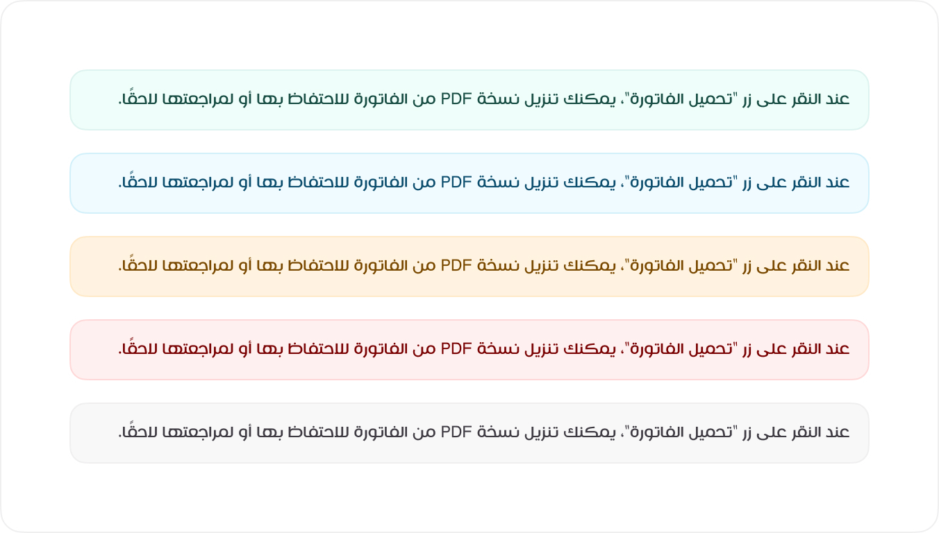
The Alert Component provides users with visual feedback and important system messages. Each alert is color-coded based on its purpose and severity. Below are the available alert styles and their use cases.
Examples
Alerts provide contextual feedback messages for typical user actions. Each alert type is color-coded to indicate the importance and nature of the message. To apply the correct styling, use one of the predefined classes (e.g., .alert-success).
HTML
<div class="alert alert-success mb-3">اذا لم يتم تحديد اياً من الخدمات، سيقوم النظام بتحديد الخدمات الاكثر طلباً</div>
<div class="alert alert-info mb-3">اذا لم يتم تحديد اياً من الخدمات، سيقوم النظام بتحديد الخدمات الاكثر طلباً</div>
<div class="alert alert-warning mb-3">اذا لم يتم تحديد اياً من الخدمات، سيقوم النظام بتحديد الخدمات الاكثر طلباً</div>
<div class="alert alert-danger mb-3">اذا لم يتم تحديد اياً من الخدمات، سيقوم النظام بتحديد الخدمات الاكثر طلباً</div>
<div class="alert">اذا لم يتم تحديد اياً من الخدمات، سيقوم النظام بتحديد الخدمات الاكثر طلباً</div>
<!-- Usage Example -->
<Alert
type="danger"
message="اذا لم يتم تحديد اياً من الخدمات، سيقوم النظام بتحديد الخدمات الاكثر طلباً"
/>

<!-- Vue Component Code Block -->
<template>
<div :class="'mb3 alert alert-' + (type ? type : 'success')">
  {{ message }}
</div>
</template>

<script setup>
defineProps({
type: String,
message: String,
})
</script>
Types of Alerts
The following is the basic code structure of how an accordion has be created. This code structure can be used to create custom accordion elements. For example, you may want to change the icon used to indicate an open and closed state.
| Alert Type | Description |
|---|---|
| Success | Indicates a successful action or confirmation. |
| Info | Provides informational messages for users. |
| Warning | Alerts users to potential issues or caution. |
| Error | Communicates errors or failures. |
| Neutral | General notifications without urgency. |
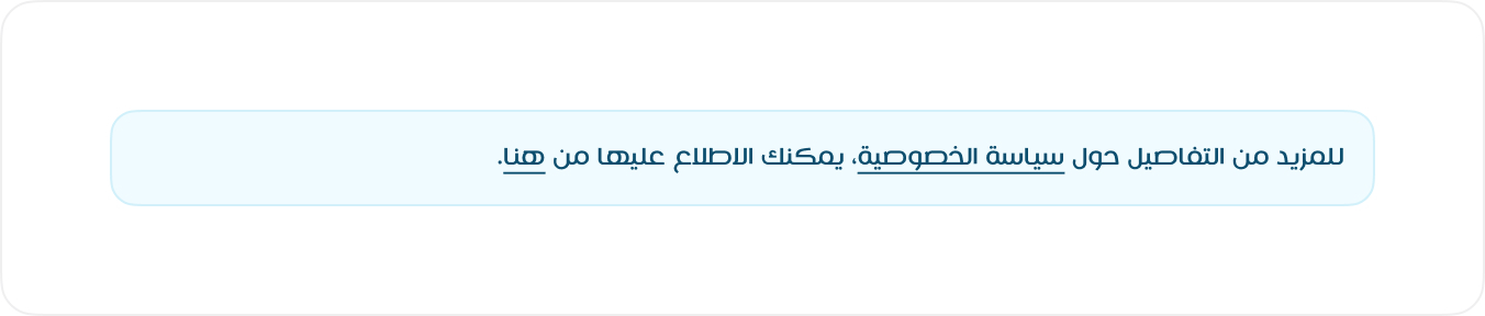
Link
To include a link within an alert, use the .alert-link class to ensure the link matches the alert’s style and remains readable.
HTML
<div class="alert alert-info mb-3">اذا لم يتم تحديد اياً من الخدمات، سيقوم <a class="alert-link" href="#!">النظام</a> بتحديد الخدمات الاكثر طلباً</div>