Toggle
Contents
The toggle switch allows users to enable or disable a setting with a simple interaction. It supports different sizes and states to fit various UI designs.
Introduction
A toggle switch allows users to enable or disable a setting with a single tap or click. It provides a clear visual representation of an on/off state, making it useful for settings, preferences, and quick actions.
Code structure
The toggle component follows a structured format to ensure consistency across different sizes and states.
HTML
<div class="form-check form-switch">
<input class="form-check-input" type="checkbox" role="switch">
</div>
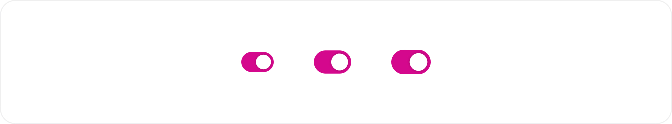
Toggle Sizes
Toggle sizes adjust to different UI needs. The Large Toggle .toggle-lg is for prominent actions, the Medium Toggle .toggle-md is the standard size, and the Small Toggle .toggle-sm fits compact spaces.
HTML
<div class="form-check form-switch">
<input class="form-check-input" type="checkbox" role="switch" checked>
</div>
<div class="form-check form-switch">
<input class="form-check-input form-check-input-lg" type="checkbox" role="switch" checked>
</div>
<!-- Usage Example -->
<div class="mb-3">
  <DefaultToggle v-model="lgIsEnabled" size="lg" label="large" id="featureToggle" />
</div>
<div class="mb-3">
  <DefaultToggle v-model="mdIsEnabled" size="md" label="medium" id="featureToggle" />
</div>
<div class="mb-3">
  <DefaultToggle v-model="smIsEnabled" size="sm" label="small" id="featureToggle" />
</div>
<!-- Vue Component Code Block -->
<template>
  <div class="form-check form-switch">
    <input
      :disabled="disabled"
      class="form-check-input"
      :class="size ? 'form-check-input-' + size : ''"
      type="checkbox"
      role="switch"
      :id="id"
      :checked="modelValue"
      @change="$emit('update:modelValue', $event.target.checked)"
    />
    <label v-if="label" class="form-check-label" :for="id">{{ label }}</label>
  </div>
</template>
<script setup>
defineProps({
  modelValue: Boolean,
  label: String,
  id: String,
  size: String,
  disabled: Boolean,
})

defineEmits(['update:modelValue'])
</script>
Disabled Toggle
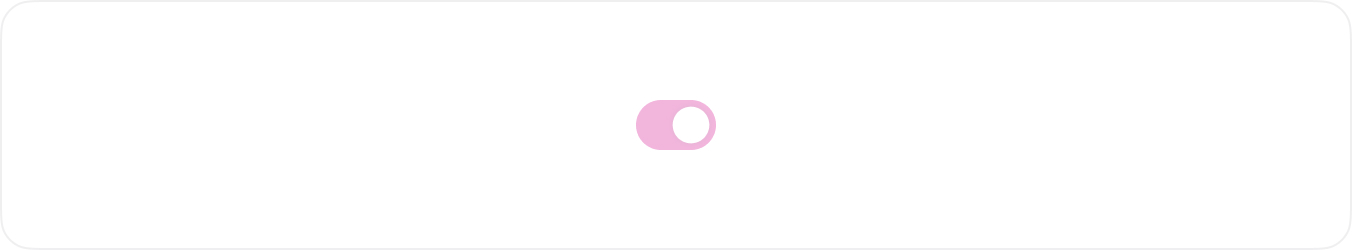
When a toggle is disabled, it appears faded and does not respond to user interactions. This is useful when the option is unavailable due to conditions that must be met first.
HTML
<div class="form-check form-switch">
<input class="form-check-input" type="checkbox" role="switch" checked disabled>
</div>
<!-- Usage Example -->
  <DefaultToggle v-model="disabledIsEnabled" size="lg" :disabled="true" label="تفعيل الميزة" id="featureToggle" />
<!-- Vue Component Code Block -->
<template>
  <div class="form-check form-switch">
    <input
      :disabled="disabled"
      class="form-check-input"
      :class="size ? 'form-check-input-' + size : ''"
      type="checkbox"
      role="switch"
      :id="id"
      :checked="modelValue"
      @change="$emit('update:modelValue', $event.target.checked)"
    />
    <label v-if="label" class="form-check-label" :for="id">{{ label }}</label>
  </div>
</template>
<script setup>
defineProps({
  modelValue: Boolean,
  label: String,
  id: String,
  size: String,
  disabled: Boolean,
})

defineEmits(['update:modelValue'])
</script>