Buttons
Contents
A button in HTML is a clickable UI component, designed to trigger a specific action or event. Essential in web interfaces, they guide user interactions, from form submissions to navigation.
Introduction
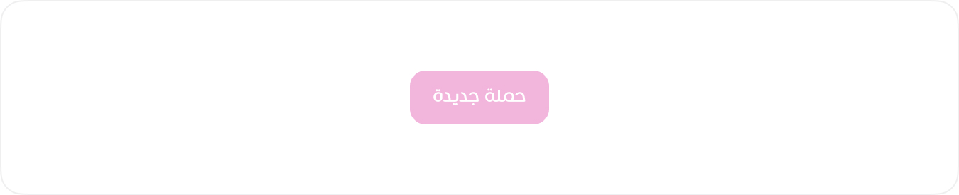
Buttons are essential interactive elements in the user interface, facilitating various actions and enhancing user experience. Our button system supports multiple sizes and styles to fit different use cases.
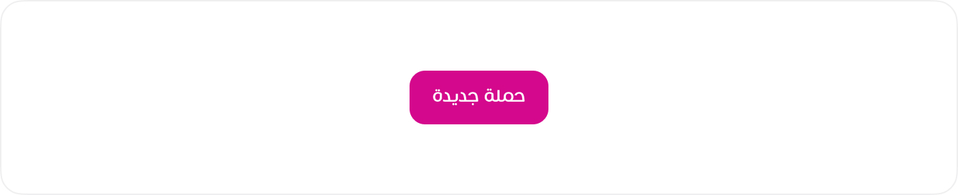
Default Buttons
These are the primary buttons used across the interface.
HTML
<button class="btn btn-primary">حملة جديدة</button>
<!-- Usage Example -->
<Button
  btn-style="success"
  label="زر نوع button"
  :on-click="function"
/>
<!-- type a href -->
<Button
  type="a"
  btn-style="success"
  href="/components/alert"
  label="زر نوع a"
/>
<!-- Vue Component Code Block -->
<template>
  <a v-if="type === 'a'" :href="href" :class="buttonClasses" :aria-disabled="disabled">
    <span v-if="icon" :class="icon + ' btn-icon'"></span>
    {{ label }}
  </a>

  <button v-else type="button" :disabled="disabled" @click="onClick" :class="buttonClasses">
    <span v-if="icon" :class="icon + ' btn-icon'"></span>
    {{ label }}
  </button>
</template>
<script setup>
const props = defineProps({
  type: { type: String, default: 'button' },
  label: String,
  btnStyle: String,
  btnSize: String,
  href: String,
  icon: String,
  disabled: Boolean,
  onClick: Function,
})

const buttonClasses = [
  'btn',
  `btn-${props.btnStyle || 'btn-primary'}`,
  props.btnSize && `btn-${props.btnSize}`,
]
</script>
Code structure
The following is the basic code structure of a button used in the design system. Buttons come in various styles, sizes, and colors, ensuring consistency and flexibility in UI design.
HTML
<button class="btn {btn-style} {btn-size}" type="button">
....
</button>
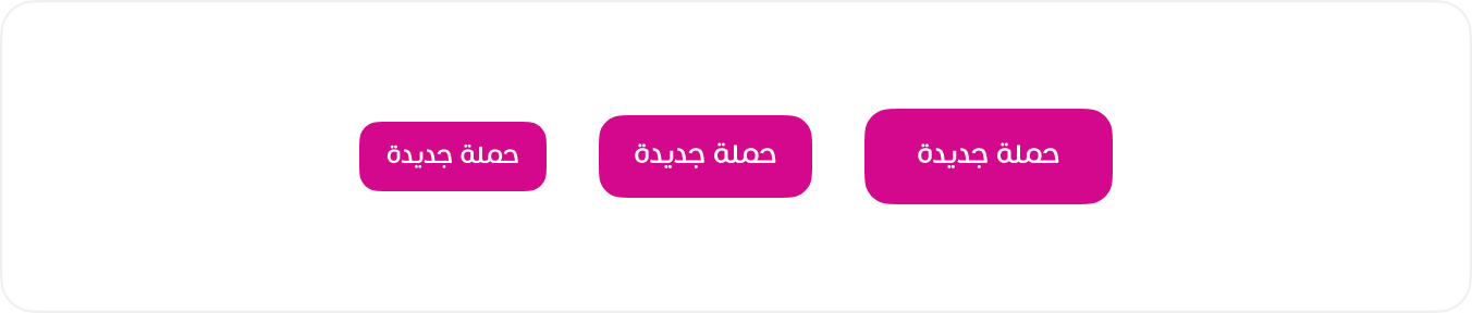
Size variations
Buttons come in multiple sizes to fit different UI requirements. The available sizes ensure consistency and usability across various layouts. Use .btn-lg and .btn-sm to apply the appropriate button size.
HTML
<button class="btn btn-primary btn-sm">حملة جديدة</button>
<button class="btn btn-primary">حملة جديدة</button>
<button class="btn btn-primary btn-lg">حملة جديدة</button>
<!-- Usage Example -->
<Button
type="a"
btn-style="success"
btn-size="lg"
href="/components/alert"
label="زر نوع a"
/>
<Button
type="a"
btn-style="success"
btn-size="sm"
href="/components/alert"
label="زر نوع a"
/>
<Button
type="a"
btn-style="success"
btn-size="md"
href="/components/alert"
label="زر نوع a"
/>
<!-- Vue Component Code Block -->
<template>
<a v-if="type === 'a'" :href="href" :class="buttonClasses" :aria-disabled="disabled">
<span v-if="icon" :class="icon + ' btn-icon'"></span>
{{ label }}
</a>
<button v-else type="button" :disabled="disabled" @click="onClick" :class="buttonClasses">
<span v-if="icon" :class="icon + ' btn-icon'"></span>
{{ label }}
</button>
</template>
<script setup>
const props = defineProps({
type: { type: String, default: 'button' },
label: String,
btnStyle: String,
btnSize: String,
href: String,
icon: String,
disabled: Boolean,
onClick: Function,
})
const buttonClasses = [
'btn',
`btn-${props.btnStyle || 'btn-primary'}`,
props.btnSize && `btn-${props.btnSize}`,
]
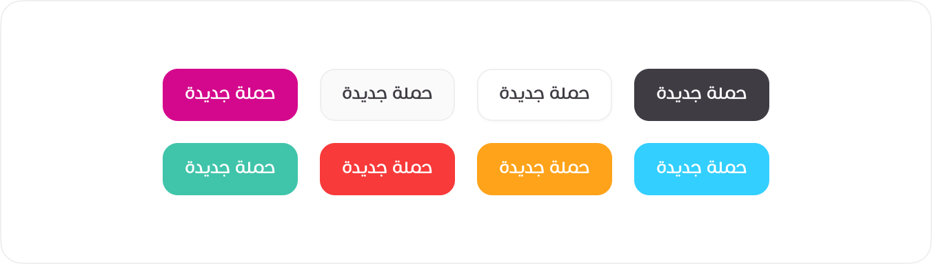
</script>Color Variations
Buttons come in different colors to represent various actions and statuses. Use predefined classes like .btn-primary, .btn-secondary, .btn-danger, and others to apply the appropriate style.
HTML
<button class="btn btn-primary">حملة جديدة</button>
<button class="btn btn-secondary">حملة جديدة</button>
<button class="btn btn-white">حملة جديدة</button>
<button class="btn btn-dark">حملة جديدة</button>
<button class="btn btn-success">حملة جديدة</button>
<button class="btn btn-danger">حملة جديدة</button>
<button class="btn btn-warning">حملة جديدة</button>
<button class="btn btn-info">حملة جديدة</button>
<!-- Usage Example -->
<Button
  type="a"
  btn-style="primary"
  href="/components/alert"
  label="زر نوع a"
/>
<Button
  type="a"
  btn-style="dark"
  href="/components/alert"
  label="زر نوع a"
/>
<Button
  type="a"
  btn-style="warning"
  href="/components/alert"
  label="زر نوع a"
/>
<!-- Vue Component Code Block -->
<template>
  <a v-if="type === 'a'" :href="href" :class="buttonClasses" :aria-disabled="disabled">
    <span v-if="icon" :class="icon + ' btn-icon'"></span>
    {{ label }}
  </a>

  <button v-else type="button" :disabled="disabled" @click="onClick" :class="buttonClasses">
    <span v-if="icon" :class="icon + ' btn-icon'"></span>
    {{ label }}
  </button>
</template>
<script setup>
const props = defineProps({
  type: { type: String, default: 'button' },
  label: String,
  btnStyle: String,
  btnSize: String,
  href: String,
  icon: String,
  disabled: Boolean,
  onClick: Function,
})

const buttonClasses = [
  'btn',
  `btn-${props.btnStyle || 'btn-primary'}`,
  props.btnSize && `btn-${props.btnSize}`,
]
</script>
Different Cases
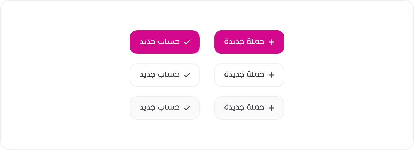
In certain cases, buttons include small icons alongside text for enhanced clarity and quick recognition. These icons typically represent actions such as addition (+), confirmation (✓), or status updates. The icon size is adjusted to maintain visual balance within the button.
HTML
<button class="btn btn-primary"><span class="tticon-check btn-icon"></span> حساب جديد</button>
<button class="btn btn-primary"><span class="tticon-plus btn-icon"></span> حملة جديدة</button>
<button class="btn btn-white"><span class="tticon-check btn-icon"></span> حساب جديد</button>
<button class="btn btn-white"><span class="tticon-plus btn-icon"></span> حملة جديدة</button>
<button class="btn btn-secondary"><span class="tticon-check btn-icon"></span> حساب جديد</button>
<button class="btn btn-secondary"><span class="tticon-plus btn-icon"></span> حملة جديدة</button>
<!-- Usage Example -->
<Button
icon="tticon-check"
btn-style="primary"
href="/components/alert"
label="زر نوع a"
/>
<!-- Vue Component Code Block -->
<template>
<a v-if="type === 'a'" :href="href" :class="buttonClasses" :aria-disabled="disabled">
<span v-if="icon" :class="icon + ' btn-icon'"></span>
{{ label }}
</a>
<button v-else type="button" :disabled="disabled" @click="onClick" :class="buttonClasses">
<span v-if="icon" :class="icon + ' btn-icon'"></span>
{{ label }}
</button>
</template>
<script setup>
const props = defineProps({
type: { type: String, default: 'button' },
label: String,
btnStyle: String,
btnSize: String,
href: String,
icon: String,
disabled: Boolean,
onClick: Function,
})
const buttonClasses = [
'btn',
`btn-${props.btnStyle || 'btn-primary'}`,
props.btnSize && `btn-${props.btnSize}`,
]
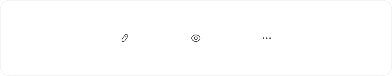
</script>Only icon
Icon buttons are designed for quick actions without text labels. They provide a compact and efficient way to interact with the interface, often used for navigation, actions, or toggles.
HTML
<button class="btn btn-square"><span class="tticon-pen btn-icon"></span></button>
<button class="btn btn-square"><span class="tticon-eye btn-icon"></span></button>
<button class="btn btn-square"><span class="tticon-dots-horizontal-bold btn-icon"></span></button>
<!-- Usage Example -->
<Button
  icon="tticon-check"
  btn-style="primary"
  href="/components/alert"
/>
<!-- Vue Component Code Block -->
<template>
  <a v-if="type === 'a'" :href="href" :class="buttonClasses" :aria-disabled="disabled">
    <span v-if="icon" :class="icon + ' btn-icon'"></span>
    {{ label }}
  </a>

  <button v-else type="button" :disabled="disabled" @click="onClick" :class="buttonClasses">
    <span v-if="icon" :class="icon + ' btn-icon'"></span>
    {{ label }}
  </button>
</template>
<script setup>
const props = defineProps({
  type: { type: String, default: 'button' },
  label: String,
  btnStyle: String,
  btnSize: String,
  href: String,
  icon: String,
  disabled: Boolean,
  onClick: Function,
})

const buttonClasses = [
  'btn',
  `btn-${props.btnStyle || 'btn-primary'}`,
  props.btnSize && `btn-${props.btnSize}`,
]
</script>
Disabled Button
Disabled buttons indicate actions that are unavailable to the user at the moment. They appear visually subdued and do not respond to interactions. Use the disabled attribute for <button> or <a> elements to apply this state.
HTML
<button class="btn btn-primary" disabled>حملة جديدة</button>
<!-- Usage Example -->
<Button
  btn-style="primary"
  label="زر مقفل"
  :disabled="true"
/>
<!-- Vue Component Code Block -->
<template>
  <a v-if="type === 'a'" :href="href" :class="buttonClasses" :aria-disabled="disabled">
    <span v-if="icon" :class="icon + ' btn-icon'"></span>
    {{ label }}
  </a>

  <button v-else type="button" :disabled="disabled" @click="onClick" :class="buttonClasses">
    <span v-if="icon" :class="icon + ' btn-icon'"></span>
    {{ label }}
  </button>
</template>
<script setup>
const props = defineProps({
  type: { type: String, default: 'button' },
  label: String,
  btnStyle: String,
  btnSize: String,
  href: String,
  icon: String,
  disabled: Boolean,
  onClick: Function,
})

const buttonClasses = [
  'btn',
  `btn-${props.btnStyle || 'btn-primary'}`,
  props.btnSize && `btn-${props.btnSize}`,
]
</script>