Forms


 Last updated 3 months ago
Checks and Radios
Contents
The Checks and Radios component provides interactive selection options for users, allowing them to choose between multiple predefined choices. These elements enhance form usability by making selections clear and accessible.
Code structure
The following is the basic structure of a Select component:
HTML
<div class="form-check">
<input class="form-check-input" type="checkbox" value="" id="check-id-01">
<label class="form-check-label" for="check-id-01">تفعيل التنبيهات</label>
</div>
HTML
<label class="form-label">الجنس</label>
<div class="form-radio-group">
<div class="form-check">
<input class="form-check-input" type="radio" name="gender" id="male" checked>
<label class="form-check-label" for="male">ذكر</label>
</div>
<div class="form-check">
<input class="form-check-input" type="radio" name="gender" id="female">
<label class="form-check-label" for="female">أنثى</label>
</div>
</div>
Checkboxes
Allow multiple selections at once.
View Mode
HTML
<input class="form-check-input" type="checkbox">
<!-- Usage Example -->
<DefaultCheckbox v-model="checkboxzero" name="checkboxzero" id="checkboxzero" label="" />
// import { ref } from 'vue'
// const checkboxzero = ref(false)

<!-- Vue Component Code Block -->
<template>
  <div class="form-check">
    <input
      class="form-check-input"
      type="checkbox"
      :checked="modelValue"
      @change="$emit('update:modelValue', $event.target.checked)"
      :name="name"
      :id="id"
    />
    <label class="form-check-label" :for="id">{{ label }}</label>
  </div>
</template>

<script setup>
defineProps({
  label: String,
  modelValue: Boolean,
  name: String,
  id: String,
})

defineEmits(['update:modelValue'])
</script>
Labeled Checkboxes
Improve clarity by associating text labels with selection options.
View Mode
HTML
<div class="row g-2">
<div class="col-sm-6">
<div class="form-check">
<input class="form-check-input" type="checkbox" value="" id="my-id-01">
<label class="form-check-label" for="my-id-01">عرض في الصفحة الرئيسية </label>
</div>
</div>
<div class="col-sm-6">
<div class="form-check">
<input class="form-check-input" type="checkbox" value="" id="my-id-02">
<label class="form-check-label" for="my-id-02">الخطوات في صفحة الخدمة</label>
</div>
</div>
<div class="col-sm-6">
<div class="form-check">
<input class="form-check-input" type="checkbox" value="" id="my-id-03" checked>
<label class="form-check-label" for="my-id-03">رسوم مالية مقابل الخدمة؟</label>
</div>
</div>
<div class="col-sm-6">
<div class="form-check">
<input class="form-check-input" type="checkbox" value="" id="my-id-04">
<label class="form-check-label" for="my-id-04">شروط الحصول علي الخدمة في صفحة الخدمة</label>
</div>
</div>
</div>
<!-- Usage Example -->
<DefaultCheckbox v-model="checkboxone" label="عرض في الصفحة الرئيسية" name="checkboxone" id="checkboxone" />
// import { ref } from 'vue'
// const checkboxone = ref(true)

<!-- Vue Component Code Block -->
<template>
  <div class="form-check">
    <input
      class="form-check-input"
      type="checkbox"
      :checked="modelValue"
      @change="$emit('update:modelValue', $event.target.checked)"
      :name="name"
      :id="id"
    />
    <label class="form-check-label" :for="id">{{ label }}</label>
  </div>
</template>

<script setup>
defineProps({
  label: String,
  modelValue: Boolean,
  name: String,
  id: String,
})

defineEmits(['update:modelValue'])
</script>
Multi Select
The following is the basic structure of a Select component .select-multi
View Mode
HTML
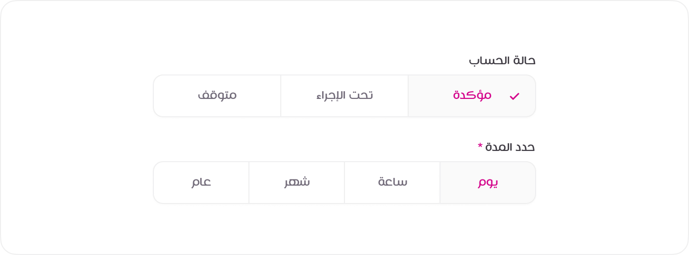
<div class="mb-3">
<label class="form-label">التنفيذ حسب <span class="text-danger">*</span></label>
<div class="form-radio-group">
<div class="form-check">
<input class="form-check-input" type="radio" name="duration" id="year">
<label class="form-check-label" for="year">عام</label>
</div>
<div class="form-check">
<input class="form-check-input" type="radio" name="duration" id="month">
<label class="form-check-label" for="month">شهر</label>
</div>
<div class="form-check">
<input class="form-check-input" type="radio" name="duration" id="day" checked>
<label class="form-check-label" for="day">يوم</label>
</div>
<div class="form-check">
<input class="form-check-input" type="radio" name="duration" id="hour">
<label class="form-check-label" for="hour">ساعة</label>
</div>
</div>
</div>
<div>
<label class="form-label">الجنس <span class="text-danger">*</span></label>
<div class="form-radio-group">
<div class="form-check">
<input class="form-check-input" type="radio" name="gender" id="male">
<label class="form-check-label" for="male">ذكر</label>
</div>
<div class="form-check">
<input class="form-check-input" type="radio" name="gender" id="female">
<label class="form-check-label" for="female">انثى</label>
</div>
</div>
</div>
<!-- Usage Example -->
<DefaultRadio v-model="radioone" name="duration" id="year" label="عام" value="year" />
<DefaultRadio v-model="radioone" name="duration" id="month" label="شهر" value="month" />
// import { ref } from 'vue'
// const radioone = ref('year')

<!-- Vue Component Code Block -->
<template>
  <div class="form-check">
    <input
      class="form-check-input"
      type="radio"
      :value="value"
      :checked="modelValue === value"
      @change="$emit('update:modelValue', value)"
      :name="name"
      :id="id"
    />
    <label class="form-check-label" :for="id">{{ label }}</label>
  </div>
</template>

<script setup>
defineProps({
  label: String,
  modelValue: [String, Number],
  value: [String, Number],
  name: String,
  id: String,
})

defineEmits(['update:modelValue'])
</script>