Components
 Last updated 3 months ago
Toast
Contents
Toast notifications provide brief, non-intrusive messages to inform users about system events. They appear temporarily and can include actions or simple status updates.
Introduction
Toast notifications provide brief, non-intrusive messages to inform users about actions, statuses, or feedback. They can appear on hover or after an action like adding, deleting, or updating an item.
Code structure
The .toast-notification class is applied to structure the toast component. It supports different variations like hover-based and action-based toasts.
HTML
<div class="tt-toast-list">
<div class="tt-toast-list__item">
<span class="tt-toast-list__content">
<span class="tticon-check-bold tt-toast-list__main-icon"></span>
تم حذف الرسالة بنجاح!
</span>
<button class="btn btn-primary tt-toast-list__close-btn">إغلاق</button>
</div>
<div class="tt-toast-list__item">
<span class="tt-toast-list__content">
<span class="tticon-check-bold tt-toast-list__main-icon"></span>
تم إرسال الرسالة إلى “عبدالله الشمري”
</span>
<button class="btn btn-primary tt-toast-list__close-btn">إغلاق</button>
</div>
<div class="tt-toast-list__item">
<span class="tt-toast-list__content">
<span class="tticon-check-bold tt-toast-list__main-icon"></span>
تم إعادة توجيه الرسالة إلى “أحمد العنزي”
</span>
<button class="btn btn-primary tt-toast-list__close-btn">إغلاق</button>
</div>
</div>
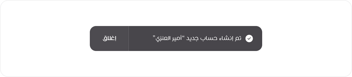
Basic Toast
This is the primary toast notification, featuring an icon for visual feedback and a button for user interaction. It is used for important updates that require acknowledgment or further action.
View Mode
HTML
<div class="tt-toast-list">
<div class="tt-toast-list__item">
<span class="tt-toast-list__content">
<span class="tticon-check-bold tt-toast-list__main-icon"></span>
تم إنشاء حساب جديد “أمير العنزي”
</span>
<button class="btn btn-primary tt-toast-list__close-btn">إغلاق</button>
</div>
</div>
<!-- Usage Example -->
<DefaultToast message="تمت العملية بنجاح" />
<!-- Vue Component Code Block -->
<template>
  <div v-if="visible" class="tt-toast-list">
    <div class="tt-toast-list__item">
      <span class="tt-toast-list__content">
        <span class="tticon-check-bold tt-toast-list__main-icon"></span>
        {{ message }}
      </span>
      <button class="btn btn-primary tt-toast-list__close-btn" @click="visible = false">
        إغلاق
      </button>
    </div>
  </div>
</template>
<script setup>
import { ref } from 'vue'

defineProps({ message: String })

const visible = ref(true)
</script>