Inputs
Contents
The Input component is a fundamental form element that allows users to input text, numbers, or other data. It provides a versatile interface for capturing user input, such as text fields, password fields, email fields, and more.
Overview
Input fields are vital for collecting user data. Our design system offers various input field types to suit different use cases, ensuring accessibility, consistency, and usability across applications.
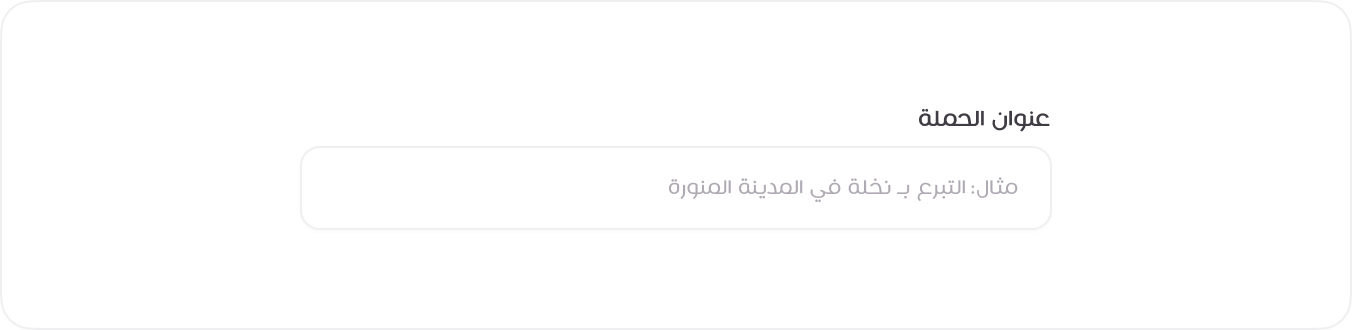
Default Input Field
The “Default Input Field” variation provides a straightforward input box for general data collection. Using the `
HTML
<label class="form-label">عنوان الحملة</label>
<input class="form-control" type="text" placeholder="مثال: التبرع بـ نخلة في المدينة المنورة">
<!-- Usage Example -->
  <template>
  <DefaultInputField
      label="عنوان الحملة"
      placeholder="مثال: التبرع بـ نخلة في المدينة المنورة"
      v-model="campaignTitle"
      />
  </template>
  <script setup>
  import { ref } from 'vue'
  const campaignTitle = ref('')
  </script>
  <!-- Vue Component Code Block -->
  <template>
      <div class="mb-3">
      <label class="form-label">{{ label }}<span v-if="required" class="text-danger">*</span></label>
      <input
          :class="'form-control' + (className ? ' ' + className : '')"
          :type="type"
          :placeholder="placeholder"
          :value="modelValue"
          :required="required"
          @input="$emit('update:modelValue', $event.target.value)"
          :name="name"
          :id="id"
      />
      </div>
  </template>

  <script setup>
  defineProps({
      label: String,
      placeholder: String,
      type: {
      type: String,
      default: 'text',
      },
      modelValue: String,
      required: Boolean,
      className: String,
      name: String,
      id: String,
  })

  defineEmits(['update:modelValue'])
  </script>
Required Input Field
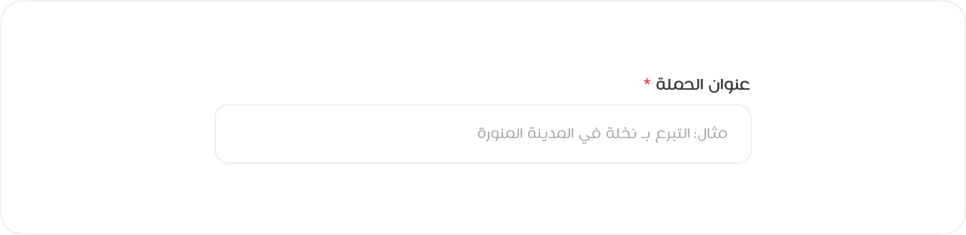
The “Required Input Field” variation ensures mandatory data entry by visually indicating ` required ` fields with a red asterisk (*). By applying the required attribute alongside the form-control class, users are prompted to fill out these fields, reducing the chance of missing critical information.
HTML
<label class="form-label">عنوان الحملة <span class="text-danger">*</span></label>
<input class="form-control" type="text" placeholder="مثال: التبرع بـ نخلة في المدينة المنورة" required>
<!-- Usage Example -->
<DefaultInputField
label="عنوان الحملة"
placeholder="مثال: التبرع بـ نخلة في المدينة المنورة"
v-model="campaignTitleRequired"
:required="true"
/>
<!-- Vue Component Code Block -->
<template>
<div class="mb-3">
<label class="form-label">{{ label }}<span v-if="required" class="text-danger">*</span></label>
<input
:class="'form-control' + (className ? ' ' + className : '')"
:type="type"
:placeholder="placeholder"
:value="modelValue"
:required="required"
@input="$emit('update:modelValue', $event.target.value)"
:name="name"
:id="id"
/>
</div>
</template>
<script setup>
defineProps({
label: String,
placeholder: String,
type: {
type: String,
default: 'text',
},
modelValue: String,
required: Boolean,
className: String,
name: String,
id: String,
})
defineEmits(['update:modelValue'])
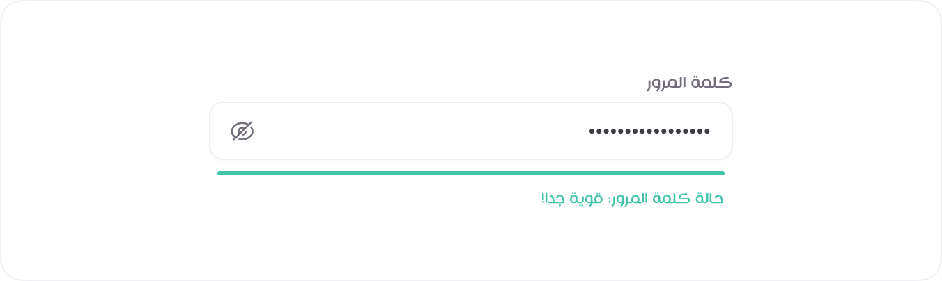
</script>Password Field with Progress
The “Password Field with Progress” variation adds a visual indicator of password strength, improving security awareness for users. A progress bar dynamically updates based on password complexity.
For ` vue `, you need to import ` DefaultInputField ` from the above component.
HTML
<label class="form-label">كلمة المرور</label>
<div class="input-group-end">
<input class="form-control text-english" type="password" placeholder="ادخل كلمة المرور الجديدة." value="#M&xoTK7aH#FRhCk">
<button class="btn btn-sm btn-square js-password-toggle-button">
<span class="tticon-eye btn-icon"></span>
<span class="tticon-eye-slash btn-icon d-none"></span>
</button>
</div>
<span class="form-password-status form-password-status--success">حالة كلمة المرور: قوية جدا!</span>
<!-- Usage Example -->
<PasswordFieldWithProgress
label="كلمة المرور"
placeholder="ادخل كلمة المرور الجديدة."
v-model="password"
:required="true"
/>
<!-- Vue Component Code Block -->
<template>
<div class="input-group-end">
  <DefaultInputField
  :label="label"
  :type="isVisible ? 'text' : 'password'"
  class-name="text-english"
  :placeholder="placeholder"
  :required="required"
  v-model="password"
  :name="name"
  :id="id"
  />
  <button type="button" class="btn btn-sm btn-square" @click="toggleVisibility">
  <span :class="isVisible ? 'tticon-eye-slash' : 'tticon-eye'"></span>
  </button>
</div>

<div class="form-password-status mt-1" :class="strengthClass">
  حالة كلمة المرور: {{ strengthText }}
</div>
</template>

<script setup>
import { ref, computed, watch } from 'vue'
import DefaultInputField from './DefaultInputField.vue'

const props = defineProps({
label: String,
placeholder: String,
modelValue: String,
required: Boolean,
name: String,
id: String,
})

const isVisible = ref(false)
const emit = defineEmits(['update:modelValue'])
const password = ref(props.modelValue || '')
// Sync local -> parent
watch(password, (val) => {
emit('update:modelValue', val)
})

// Sync parent -> local
watch(
() => props.modelValue,
(val) => {
  if (val !== password.value) {
  password.value = val
  }
},
)
function toggleVisibility() {
isVisible.value = !isVisible.value
}

// Basic strength logic — can be replaced with zxcvbn for better scoring
const strength = computed(() => {
const val = password.value
if (!val) return 'none'
if (val.length < 6) return 'weak'
if (/[a-z]/.test(val) && /[A-Z]/.test(val) && /\d/.test(val) && /[\W_]/.test(val)) {
  return 'strong'
}
return 'medium'
})

const strengthText = computed(() => {
switch (strength.value) {
  case 'weak':
  return 'ضعيفة'
  case 'medium':
  return 'متوسطة'
  case 'strong':
  return 'قوية جدا!'
  default:
  return ''
}
})

const strengthClass = computed(() => {
return {
  'form-password-status--danger': strength.value === 'weak',
  'form-password-status--warning': strength.value === 'medium',
  'form-password-status--success': strength.value === 'strong',
}
})
</script>
Input with Validation States
The “Input with Validation States” variation visually communicates the input status using styles for success or error states. Adding classes like ` .is-valid ` or ` .is-invalid ` provides immediate feedback to users.
For ` vue `, you need to import ` DefaultInputField ` from the above component.

HTML
<label class="form-label">عنوان البريد <span class="text-danger">*</span></label>
<input class="form-control form-control-error text-english" type="text" placeholder="[email protected]" value="[email protected]" required>
<span class="form-error-msg">تنبيه: البريد المدخل موجود مسبقاً.</span>
<!-- Usage Example -->
<InputWithValidationStates
            label="عنوان البريد"
            :required="true"
            type="email"
            placeholder="[email protected]"
            class-name="text-english"
            v-model="emailWithValidationStates"
            error="تنبيه: البريد المدخل موجود مسبقاً."
          />
<!-- Vue Component Code Block -->
<template>
  <DefaultInputField
    :label="label"
    :type="type"
    :class-name="computedClass"
    :placeholder="placeholder"
    :required="required"
    v-model="inputValue"
    :name="name"
    :id="id"
  />
  <span v-if="error" class="form-error-msg">{{ error }}</span>
</template>

<script setup>
import { ref, watch, computed } from 'vue'
import DefaultInputField from './DefaultInputField.vue'

const props = defineProps({
  label: String,
  placeholder: String,
  modelValue: String,
  required: Boolean,
  error: String,
  className: String,
  type: {
    type: String,
    default: 'text',
  },
  name: String,
  id: String,
})

const emit = defineEmits(['update:modelValue'])

const inputValue = ref(props.modelValue || '')

// Watch parent -> local
watch(
  () => props.modelValue,
  (val) => {
    inputValue.value = val
  },
)

// Watch local -> parent
watch(inputValue, (val) => {
  emit('update:modelValue', val)
})

// Dynamic class handling
const computedClass = computed(() => {
  const base = props.className || ''
  return props.error ? `form-control-error ${base}` : base
})
</script>
Manual Date Input Field
This input field is divided into three separate boxes for year, month, and day, making the date entry process straightforward. Each box accepts numeric input, providing a clear format and reducing potential errors.

HTML
<label class="form-label">تاريخ الميلاد</label>
<div class="form-group">
<input class="form-control text-english" type="text" placeholder="DD">
<input class="form-control text-english" type="text" placeholder="MM">
<input class="form-control text-english" type="text" placeholder="YYYY">
</div>
<!-- Usage Example -->
<ManualDateInputField
            label="تاريخ الميلاد"
            v-model="birthDate"
            name="birthDate"
            id="birthDate"
          />
<!-- Vue Component Code Block -->
<template>
  <label class="form-label">{{ label }}</label>
  <div class="form-group d-flex gap-2">
    <input
      v-model="day"
      class="form-control text-english"
      type="text"
      placeholder="DD"
      maxlength="2"
      @input="sanitizeDay"
    />
    <input
      v-model="month"
      class="form-control text-english"
      type="text"
      placeholder="MM"
      maxlength="2"
      @input="sanitizeMonth"
    />
    <input
      v-model="year"
      class="form-control text-english"
      type="text"
      placeholder="YYYY"
      maxlength="4"
      @input="sanitizeYear"
    />

    <!-- Hidden input for form submission -->
    <input type="hidden" :name="name" :id="id" :value="formattedDate" />
  </div>
</template>

<script setup>
import { ref, watch, computed } from 'vue'

const props = defineProps({
  modelValue: String, // 'YYYY-MM-DD'
  label: String,
  required: Boolean,
  name: String,
  id: String,
})

const emit = defineEmits(['update:modelValue'])

// Parse initial value
const [initYear, initMonth, initDay] = props.modelValue?.split('-') || []

const day = ref(initDay || '')
const month = ref(initMonth || '')
const year = ref(initYear || '')

// Computed property for the formatted date
const formattedDate = computed(() => {
  return day.value.length === 2 && month.value.length === 2 && year.value.length === 4
    ? `${year.value}-${month.value}-${day.value}`
    : ''
})

// Emit updated date when fields change
watch(formattedDate, (newValue) => {
  emit('update:modelValue', newValue)
})

// Also watch if parent changes `modelValue`
watch(
  () => props.modelValue,
  (val) => {
    const [y, m, d] = val?.split('-') || []
    if (y !== year.value) year.value = y || ''
    if (m !== month.value) month.value = m || ''
    if (d !== day.value) day.value = d || ''
  },
)

// Optional sanitization
function sanitizeDay() {
  day.value = day.value.replace(/\D/g, '').slice(0, 2)
}
function sanitizeMonth() {
  month.value = month.value.replace(/\D/g, '').slice(0, 2)
}
function sanitizeYear() {
  year.value = year.value.replace(/\D/g, '').slice(0, 4)
}
</script>
Social Media Link Input Fields
This input field is divided into three separate boxes for year, month, and day, making the date entry process straightforward. Each box accepts numeric input, providing a clear format and reducing potential errors.

HTML
<div class="row g-3">
<div class="col-sm-6">
<div class="form-control-icon">
<img class="form-icon d-light-inline" src="images/logos/xcom.svg" alt="">
<img class="form-icon d-dark-inline" src="images/logos/xcom-light.svg" alt="">
<span class="form-url">https://x.com/</span>
<input class="form-control text-english" type="text" value="Abudallah-94">
</div>
</div>
<div class="col-sm-6">
<div class="form-control-icon">
<img class="form-icon" src="images/logos/facebook.svg" alt="">
<span class="form-url">https://www.facebook.com/</span>
<input class="form-control text-english" type="text">
</div>
</div>
<div class="col-sm-6">
<div class="form-control-icon">
<img class="form-icon" src="images/logos/youtube.svg" alt="">
<span class="form-url">https://www.youtube.com/</span>
<input class="form-control text-english" type="text">
</div>
</div>
<div class="col-sm-6">
<div class="form-control-icon">
<img class="form-icon" src="images/logos/snapchat.svg" alt="">
<span class="form-url">https://www.snapchat.com/</span>
<input class="form-control text-english" type="text" value="Abudallah-94">
</div>
</div>
<div class="col-sm-6">
<div class="form-control-icon">
<img class="form-icon" src="images/logos/instagram.svg" alt="">
<span class="form-url">https://www.instagram.com/</span>
<input class="form-control text-english" type="text">
</div>
</div>
<div class="col-sm-6">
<div class="form-control-icon">
<img class="form-icon" src="images/logos/linkedin.svg" alt="">
<span class="form-url">https://www.linkedin.com/</span>
<input class="form-control text-english" type="text">
</div>
</div>
</div>
<!-- Usage Example -->
<div class="col-sm-6">
<SocialMediaLinkInputField type="x" v-model="xUsername" />
</div>
<div class="col-sm-6">
<SocialMediaLinkInputField type="facebook" v-model="facebookUsername" />
</div>
<div class="col-sm-6">
<SocialMediaLinkInputField type="youtube" v-model="youtubeUsername" />
</div>
<div class="col-sm-6">
<SocialMediaLinkInputField type="snapchat" v-model="snapchatUsername" />
</div>
<div class="col-sm-6">
<SocialMediaLinkInputField type="instagram" v-model="instagramUsername" />
</div>
<div class="col-sm-6">
<SocialMediaLinkInputField type="linkedin" v-model="linkedinUsername" />
</div>
<!-- Vue Component Code Block -->
<template>
<div class="form-control-icon">
<img v-if="type === 'x'" class="form-icon d-light-inline" :src="icon.light" alt="" />
<img v-if="type === 'x'" class="form-icon d-dark-inline" :src="icon.dark" alt="" />
<img v-else class="form-icon" :src="icon" alt="" />
<span class="form-url">{{ baseUrl }}</span>
<input
class="form-control text-english"
:class="className"
type="text"
:required="required"
:name="name"
:id="id"
:value="modelValue"
@input="onInput"
/>
</div>
</template>
<script setup>
import { computed } from 'vue'
const props = defineProps({
type: {
type: String,
required: true,
},
modelValue: String,
required: Boolean,
className: String,
name: String,
id: String,
})
const emit = defineEmits(['update:modelValue'])
const onInput = (e) => {
emit('update:modelValue', e.target.value)
}
// Define URLs and icons for each platform
const baseUrl = computed(() => {
switch (props.type) {
case 'x':
return 'https://x.com/'
case 'facebook':
return 'https://www.facebook.com/'
case 'youtube':
return 'https://www.youtube.com/'
case 'snapchat':
return 'https://www.snapchat.com/'
case 'instagram':
return 'https://www.instagram.com/'
case 'linkedin':
return 'https://www.linkedin.com/'
default:
return ''
}
})
const icon = computed(() => {
switch (props.type) {
case 'x':
return {
light: '/images/logos/xcom.svg',
dark: '/images/logos/xcom-light.svg',
}
default:
return `/images/logos/${props.type}.svg`
}
})
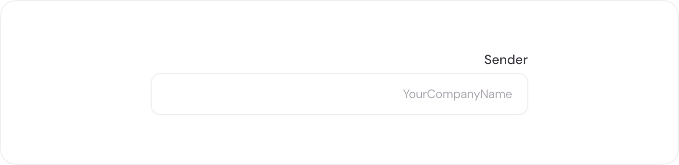
</script>English Text Input Field
This input field variation is designed specifically for inputs containing numbers and English letters, styled with the DM Sans font for enhanced readability and consistency. The ` .text-english ` class is used to apply a different font style specifically for English content.
HTML
<label class="form-label text-english">Sender</label>
<input class="form-control text-english" type="text" placeholder="YourCompanyName">
<!-- Usage Example -->
<DefaultInputField
  label="Sender"
  placeholder="YourCompanyName"
  class-name="text-english"
  v-model="companyName"
/>
<!-- Vue Component Code Block -->
<template>
  <div class="mb-3">
    <label class="form-label">{{ label }}<span v-if="required" class="text-danger">*</span></label>
    <input
      :class="'form-control' + (className ? ' ' + className : '')"
      :type="type"
      :placeholder="placeholder"
      :value="modelValue"
      :required="required"
      @input="$emit('update:modelValue', $event.target.value)"
      :name="name"
      :id="id"
    />
  </div>
</template>

<script setup>
defineProps({
  label: String,
  placeholder: String,
  type: {
    type: String,
    default: 'text',
  },
  modelValue: String,
  required: Boolean,
  className: String,
  name: String,
  id: String,
})

defineEmits(['update:modelValue'])
</script>